Failed McDonald Logo and a Lamp With a Clock—What the Hell Happened to Apple’s Icon Design?!
It’s with a heavy heart that I’m writing this post. Yes, I’m just talking about app icons and yes, I’m being dramatic, but you have to understand that I care a great deal about design. I’ve always loved Apple’s design and that’s one of the main reasons I use Apple products. I even find macOS Tahoe’s Liquid Glass—despite all the issues with readability and performance—to be stunning in terms of aesthetics and I really appreciate that they went the extra mile to emulate the real glass refraction effect.
Apple has many, many flaws, but it’s also often one of the—or perhaps the only—big tech companies that gets design right and sets trends. There’s a reason why Microsoft, Google, Samsung, Xiaomi and other big tech companies have consistently copied Apple’s design year after year.
But this is exactly why I am beyond appalled at the new icons for Apple Creator Studio, and beyond worried about Apple’s future design decisions.
Compare the current icons (bottom) and the new icons (top):
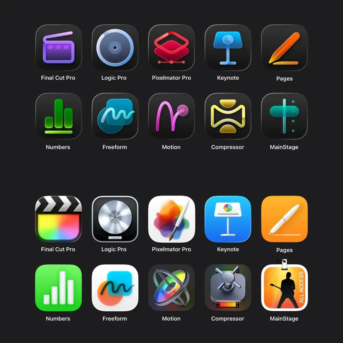
I understand that art and style are inherently subjective matters, so anyone is welcome to disagree with me, but do the new icons really have any redeeming qualities besides having a uniform style?
With no context, I showed the above two sets of icons to my wife—an Android/Windows user and a non-designer—and asked her: 1) which set is better and 2) what she thought each icon represented.
She immediately preferred the current icons (bottom group). “What happened to all the nice colours?” she asked, referring to the new icons. “It’s so hard to distinguish the new icons from each other.”
Her comments on some of the new icons really cracked me up:

In comparison—and to no one’s surprise—she was able to understand the general purpose of some of the apps just by looking at the current icons:
I was especially surprised that the current Compressor icon works so well—I didn’t think the vault-door-spinny-thing has anything to do with “compressing” but I guess it works!
Asking a layperson’s opinion on this is a simple exercise that reveals the stark difference between good and bad iconography, especially when Apple’s design has historically worked so well for the average person.
My critique
My biggest gripe with the new icon design is that most of them are way too simplified and one-dimensional when the apps are full-fledged professional tools. But, personally speaking, here are the worst offenders:
The Final Cut Pro icon
![]()
This one pains me the most, if for no other reason than the fact that it looks so much like Microsoft Clipchamp, which is a basic video editing web app that is leagues below FCP. I tested it for work and it’s terrible for professional video post-production work. For FCP to have an icon that’s so similar to Clipchamp feels like such an insult to the quality and the depth of features that FCP has.
The monochromatic and minimalist design of Clipchamp actually suits it, because Clipchamp is supposed to be just a simple video tool for quick video tasks—it’s not a full-fledged video editing program.
But FCP is that, and having such a “dumbed down” icon doesn’t reflect that it’s a professional tool with advanced features and workflows. Someone who doesn’t know much about FCP will look at the new icon and think it’s a cute little video app.
It also seems that whoever designed the new icon didn’t even bother to research what a clapperboard looks like—the checkerboard pattern is always on the two sticks at the top, and not below them like it is in the new icon:
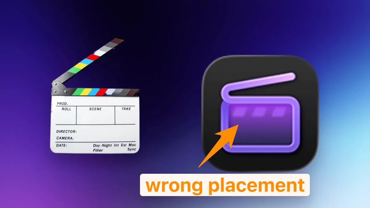
It’s a very minor detail that many people might not notice, but, once again, FCP is a professional app and professionals using FCP do know what a clapperboard is supposed to look like. For a company that is known for attention to detail, this is a massive fail. I get that the designer doesn’t need to have a background in video, but how this mistake wasn’t caught by other employees is beyond me.
The Apple Motion new icon
The new icon is rubbing salt in the wound for Apple Motion.
Apple Motion (or just “Motion”) has already always been an underrated and misunderstood motion graphics and compositing program. Many people mistakenly think it’s just an “advanced title editor” for FCP or it’s only good for “basic” motion graphics when it’s actually extremely capable for complex, advanced 3D compositing work and it has incredible real-time rendering capabilities—something that After Effects lacks.
Instead of making it clearer that Motion is a full-fledged, professional motion graphics program, the new icon seems to suggest that it’s just a simple, basic program for keyframing or maybe drawing. While the current icon isn’t very illustrative (my wife said it looked like an astrolabe and thought the app was for navigation)—at least it’s a 3D object and looks somewhat complex.
The Pixelmator Pro new icon
Let’s first take a look at Pixelmator Pro’s current icon:
![]()
It’s beautiful—breathtaking even, I dare say. It looks like a painter has just stepped away in the middle of their work and will come back later.
Every time I look at it, I get the urge to click it open and make something beautiful, like when I first bought it and made a stopwatch icon:
Pixelmator Pro is so awesome??? Kudos to @pixelmator for creating a pro app in Apple's design language. Feels like home.
— James Zhan (@thejameszhan) August 15, 2023
I needed to design some icons for work, and compared to PS, I can get stuff done way faster and easier with Pixelmator Pro.
Goodbye Photoshop! pic.twitter.com/tNLVa3r5Pg
That’s the power of a great app icon—it invites you to use the app.
The current icon is just a simple paint brush and a canvas with some watercolours, but somehow it looks gorgeous. I think the combination of the shape and the colours of the water colours is just extremely pleasant to look at. It has some resemblance to the app icon of Apple’s Photos app, which I think is ingenious since one of Pixelmator Pro’s main features is photo editing.
My first thought on the new Pixelmator Pro icon is that it looks like the Shortcuts app icon:
![]()
…which seems to be an oversight because the Shortcuts app is for, well, creating shortcuts and automations on Apple devices, and it has nothing to do with graphic design.
Arguably, however, the new Pixelmator Pro icon is clearer on what the app can do than the current icon: layers, shapes and vector, but at the same time, it’s so void of character that it feels so wrong for an app that’s supposed to be all about creativity. Just look at Pixelmator Pro’s website—it’s full of vibrant colours:
The new monochromatic, over-simplified icon design just doesn’t fit the app.
The new Logic Pro icon
Where do I even start with this one? We went from a clear, platinum record plaque to what looks like a button from a shirt, a radar or a bicycle wheel?
I struggle to understand what music-related object this is supposed to be:
It can’t be a speaker cone because that doesn’t have a hole in the middle
It doesn’t look very much like a vinyl record because one is like a solid round piece with a hole in the middle, and doesn’t have a thick outline like the new icon does
It doesn’t look like a CD for the same reason above
My best guess is that it’s supposed to be a live loop. If that’s the case, I’d argue it’s a terrible choice because not everyone is familiar with Logic Pro’s Live Loops (I never use it), while most people recognize a platinum record plaque.
. . .
I understand that these new icons are there to distinguish the subscription versions and the one-time payment versions, but looking at Apple’s official webpages for some of these pro apps, only the new icons are shown, so clearly they are supposed to be the “main” icons for these apps now. I can only hope these icon designs are not an indication of where the quality of Apple’s design is heading.
Dammit, I’m just so sad.
Reply via email. Subscribe to my blog via email or RSS feed.