Major Blog Redesign (V3)
Note: Since this post is about this blog’s design, I recommend reading this post on a desktop browser so you can see the new design. That said, it’s not mandatory as I’ve included screenshots.
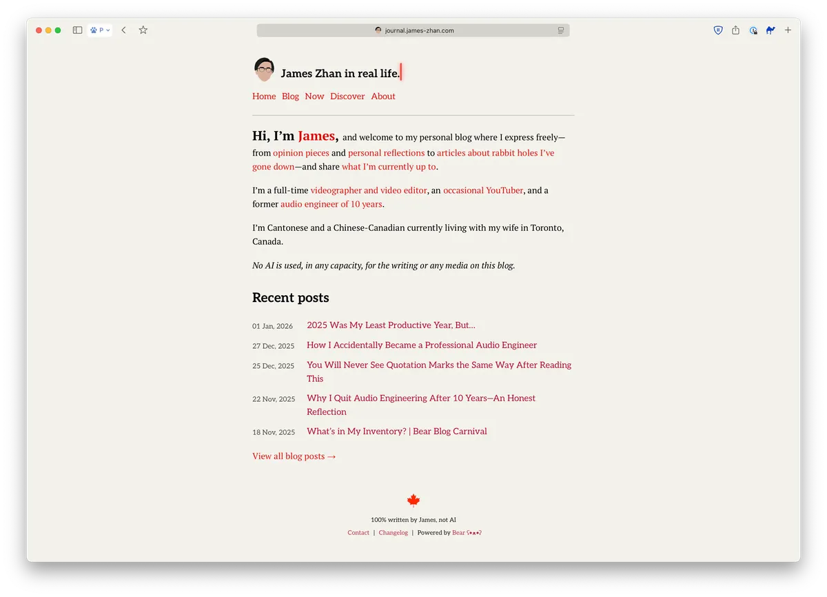
Thanks to my obsession over design and aesthetics, I’d been brainstorming for ways to improve my blog’s design because I wasn’t 100% happy with how it looked as a whole on desktop. If you check the changelog, you’ll see that I’d been tweaking the typography and the small details of the blog, such as spacing and decorative elements, trying to follow all the “best practices” for web typography. However, no matter what I changed, I still wasn’t satisfied.
The problem was that I wanted my blog to look minimalist, clean and modern, with a bit of a literary feel, but my blog somehow lacked those qualities despite me removing as many unnecessary elements as possible to the point where there was really nothing else I could remove. My blog just ended up looking kind of crude, outdated, basic and unfinished, like something is missing:
While I was just unhappy with the overall design of the blog, I could pinpoint two technical aspects that I wasn’t happy about but didn’t know how to solve:
- Too much white space in the left and right margins, but increasing line length wouldn’t be a good solution as it would reduce readability
- Texts were all too small, but increasing font sizes would make the header and navigation links take up too much space and make the overall site look like someone just increased the zoom level rather than a design decision
Three nights ago, I decided to check out some of the pre-made themes in Bear Blog for inspiration. I came across the “Docs” theme and, upon previewing it, I was shocked by how much I liked it immediately:
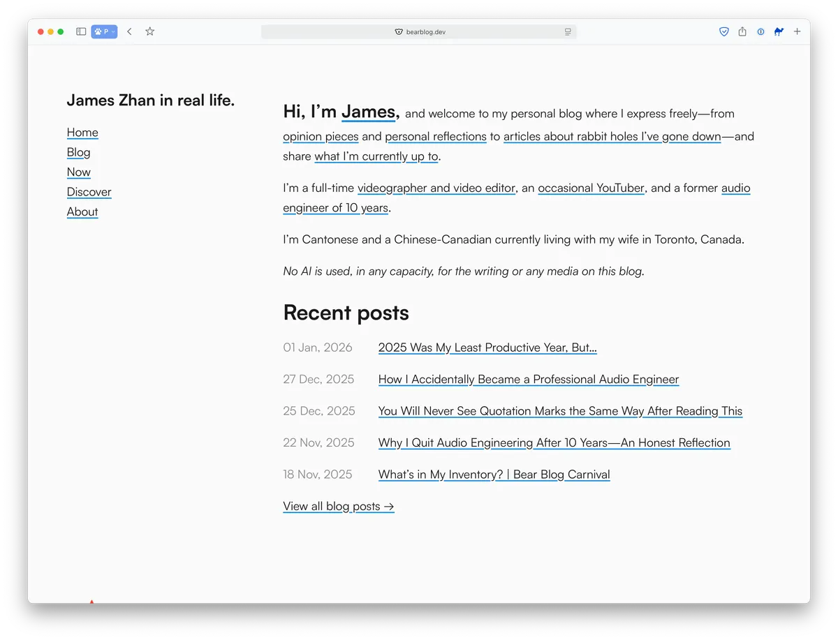
I finally realized that it was the layout that needed to be redesigned, so, with ChatGPT’s help and many hours of testing and debugging in CodeRunner, I repositioned the site title and the navigation to the left, like a sidebar. Once that was in place, everything else fell into place naturally—I knew exactly what else I needed to do.
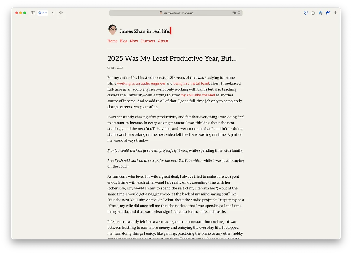
I increased the font sizes of the entire site, and then fine-tuned the font size, line length and leading of the blog post body text so it’s extremely and comfortably readable on a desktop (inspired by iA’s blog, Pimp My Type and Dan Mall’s blog).
Click on each comparison to take a closer look (opens in a new window):
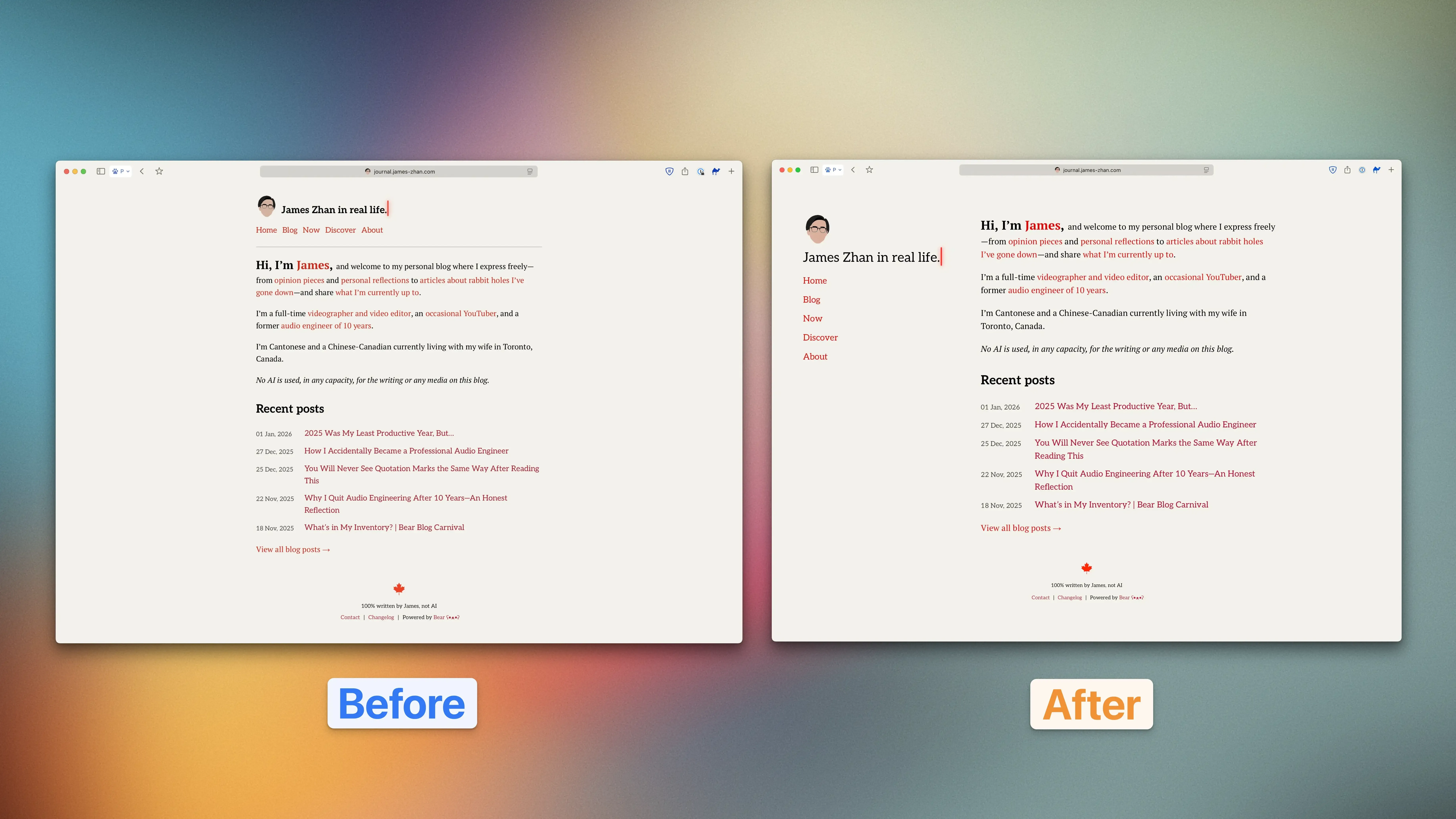
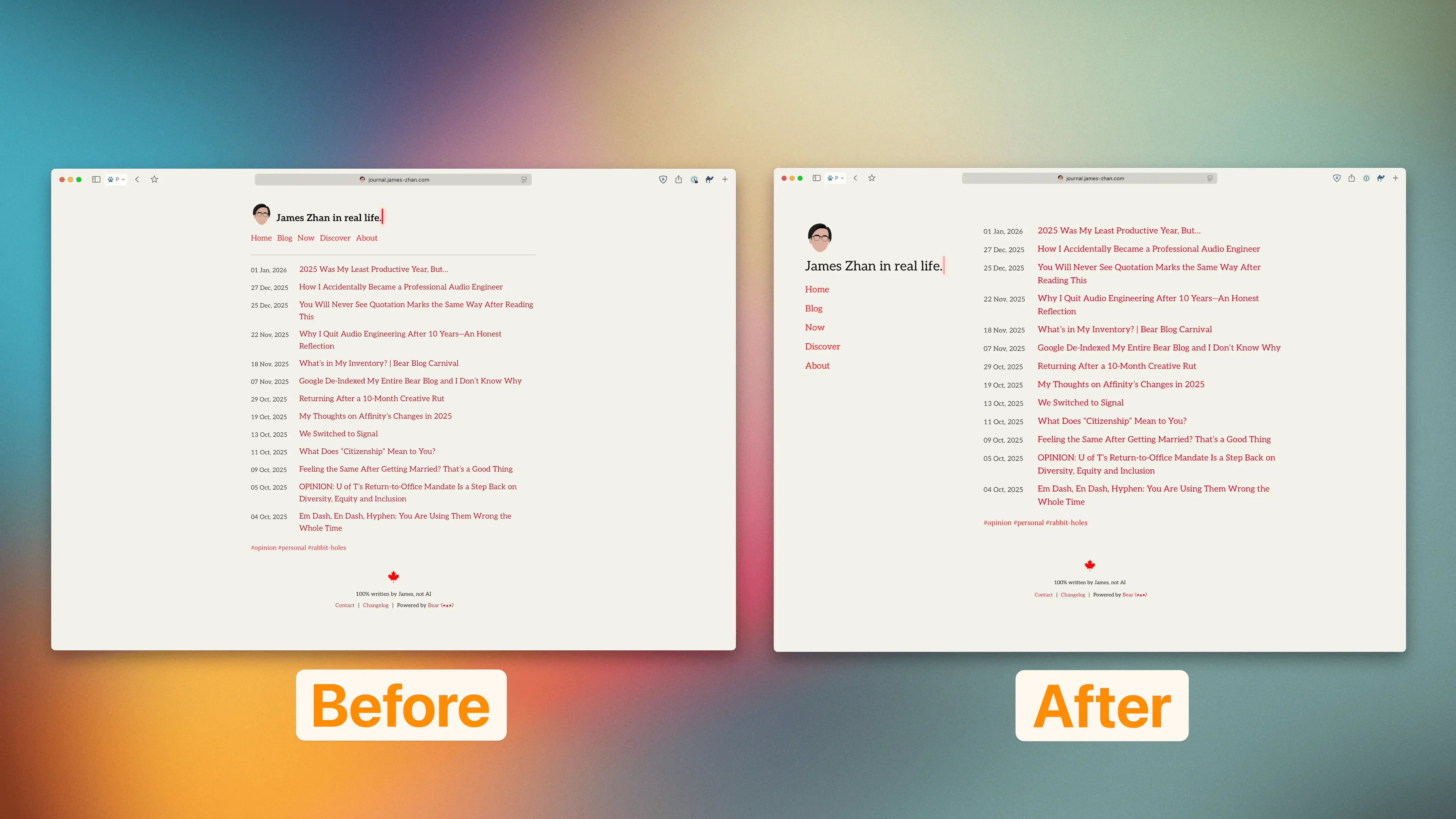
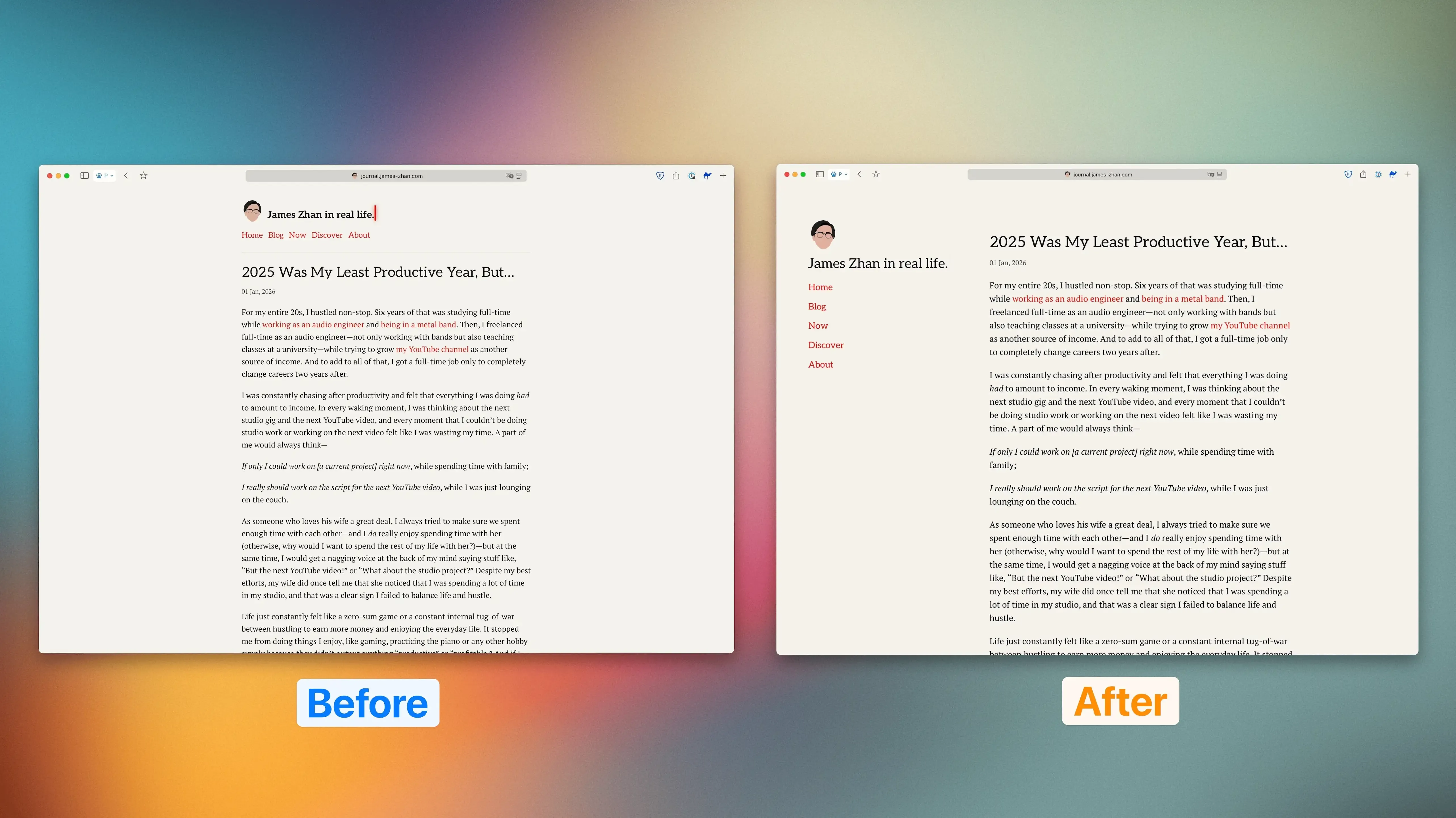
To me, the new design achieves what I envisioned in the first place—minimalist and clean in a modern and stylistic way, with a slight literary feel (thanks to the serif typefaces). I find that having the site header and navigation links on the side reduces the visual load in the main content (i.e., blog posts) and enhances the visual distinction between those two elements, thereby reducing the cognitive load when someone visits the blog. I also like that there’s much less white space overall, which I think makes the design feel more modern (i.e., designed for high res displays).
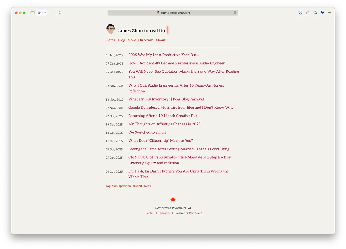
Everything on mobile looks the same except for one thing: the layout for the blog post list on the homepage and /blog/ is now more optimized for mobile screens. The dates and blog entries used to be two separate columns on mobile, but in the redesign, they have been merged:
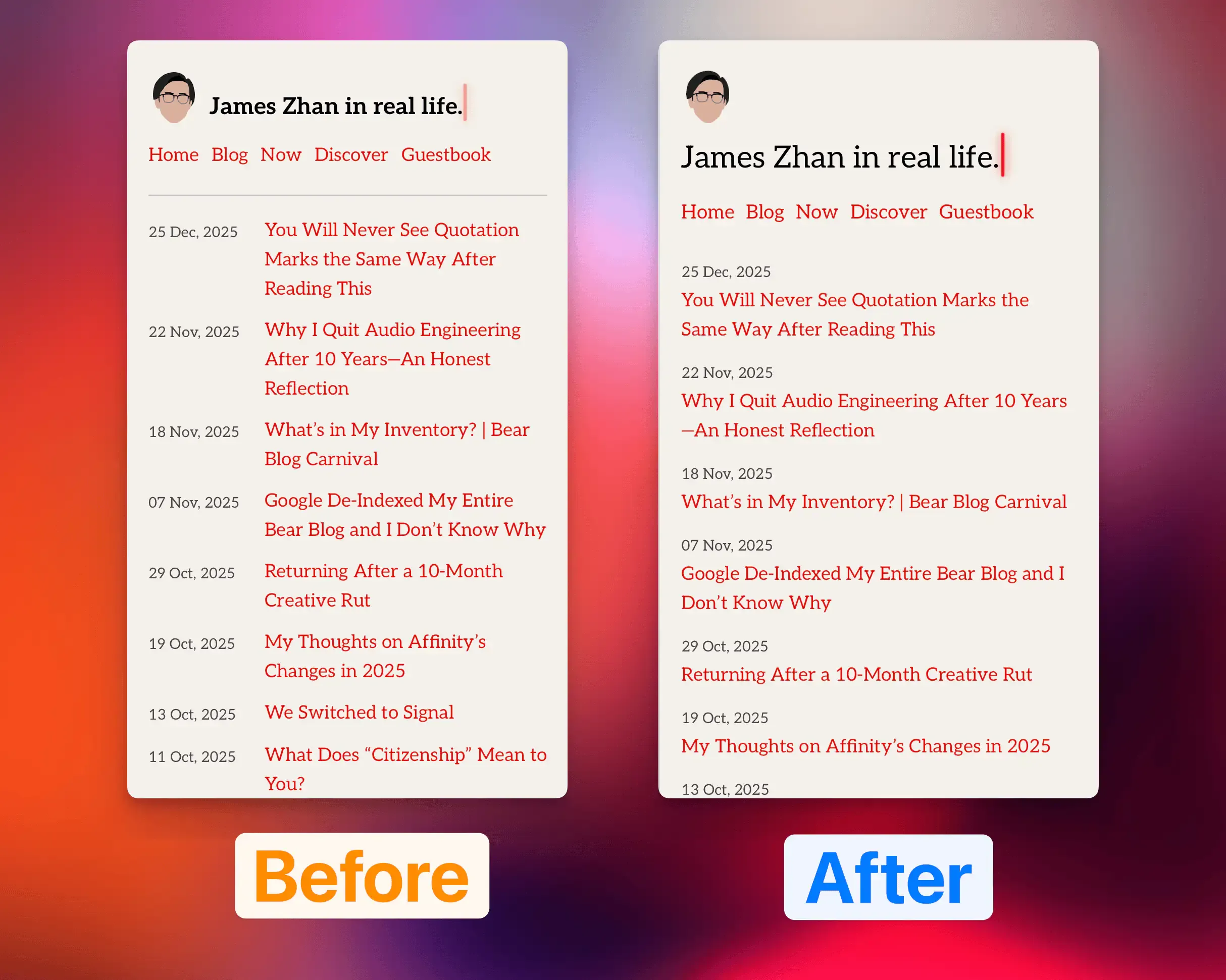
What I didn’t like about the original column design was simply that the dates were given way too much visual importance. They occupied about a quarter of the width while offering only ancillary information. Worse yet, they were on the left, where the eyes go first. Meanwhile, the post titles could only fit between five to six words on a line and so some titles ended up with three lines—not great for readability.
The new design solved all these problems. The dates are more subtle, while the post titles stand out a lot more and are much easier to read.
It’s been a few days since I published the V3 theme and looking at the site hasn’t made me immediately try to brainstorm ways to improve it, so I’d say it’s a success so far!
Reply via email. Subscribe to my blog via email or RSS feed.