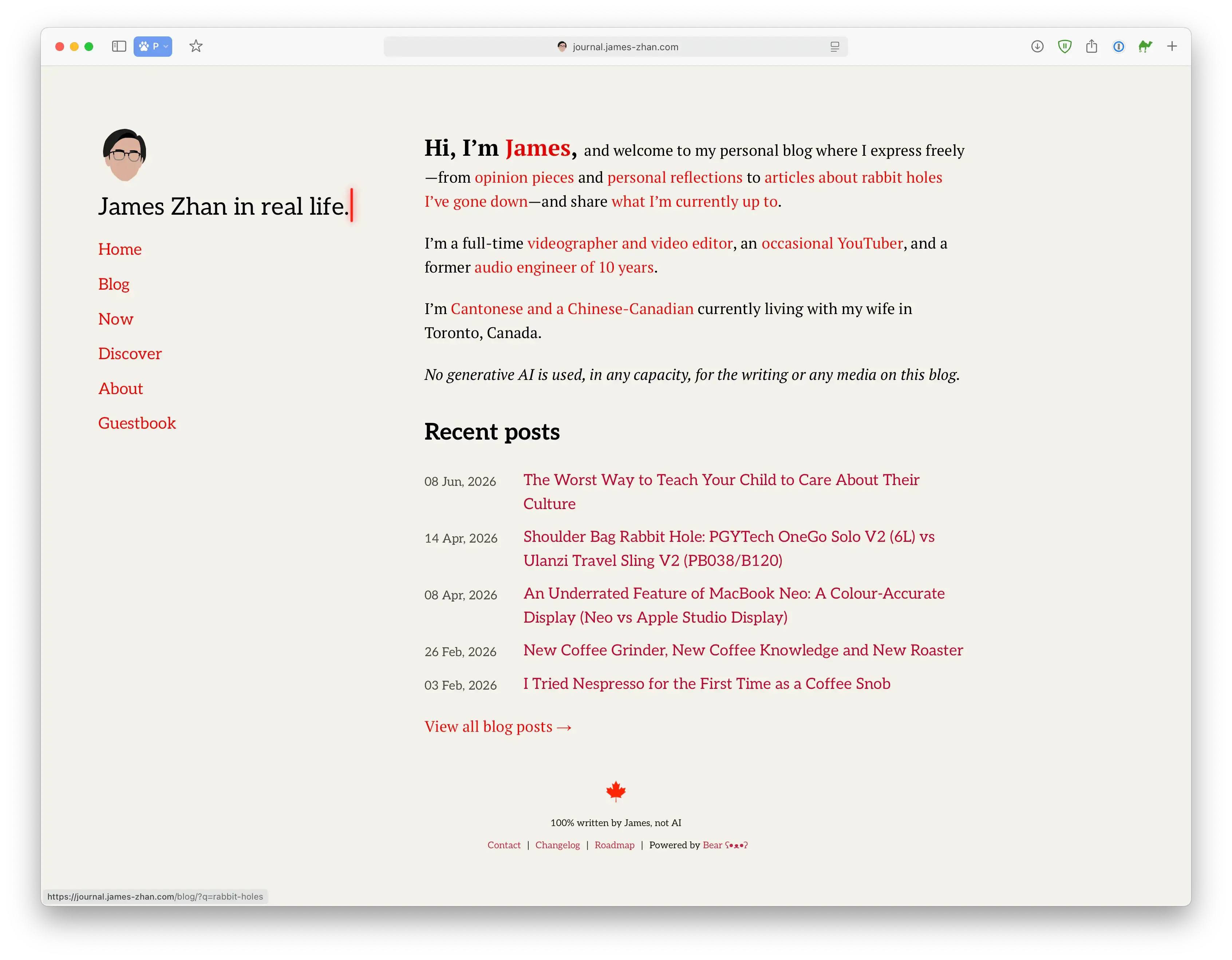
Blog Redesign (V4) and a Deep-Dive Into Typography
The tinkering never stops, eh?! Six months after I redesigned this blog to V3, I’ve just revamped it again. V3 was a two-column design with the site title and the navigation on the left (sidebar) and the main content on the right. The navigation would remain on the left column if you scroll down a post.
I really liked the V3 design and I’d be happy to keep it, but my pickiness and urge to find things to improve/tinker with is simply too strong (this is probably why I tend to go down rabbit holes on various things a lot).
Table of Contents
Separate layouts for the homepage and all other pages
Typography
Some thoughts on the role of typography
From Source Serif 4 to PT Serif
Finding Rosario
“Almost-serifs” at the terminals
Stroke contrast
Apophyge
Oldstyle figures
Quotation marks with serifs
Other smaller changes
Separate layouts for the homepage and all other pages
I decided to give the homepage its own design because I wanted it to have more of a “bio page” or landing page kind of feel, like my official site or the cover of a book. This allows for a greater distinction between the homepage and the main content.
Click “V3” and “V4” to compare the two versions of the homepage:
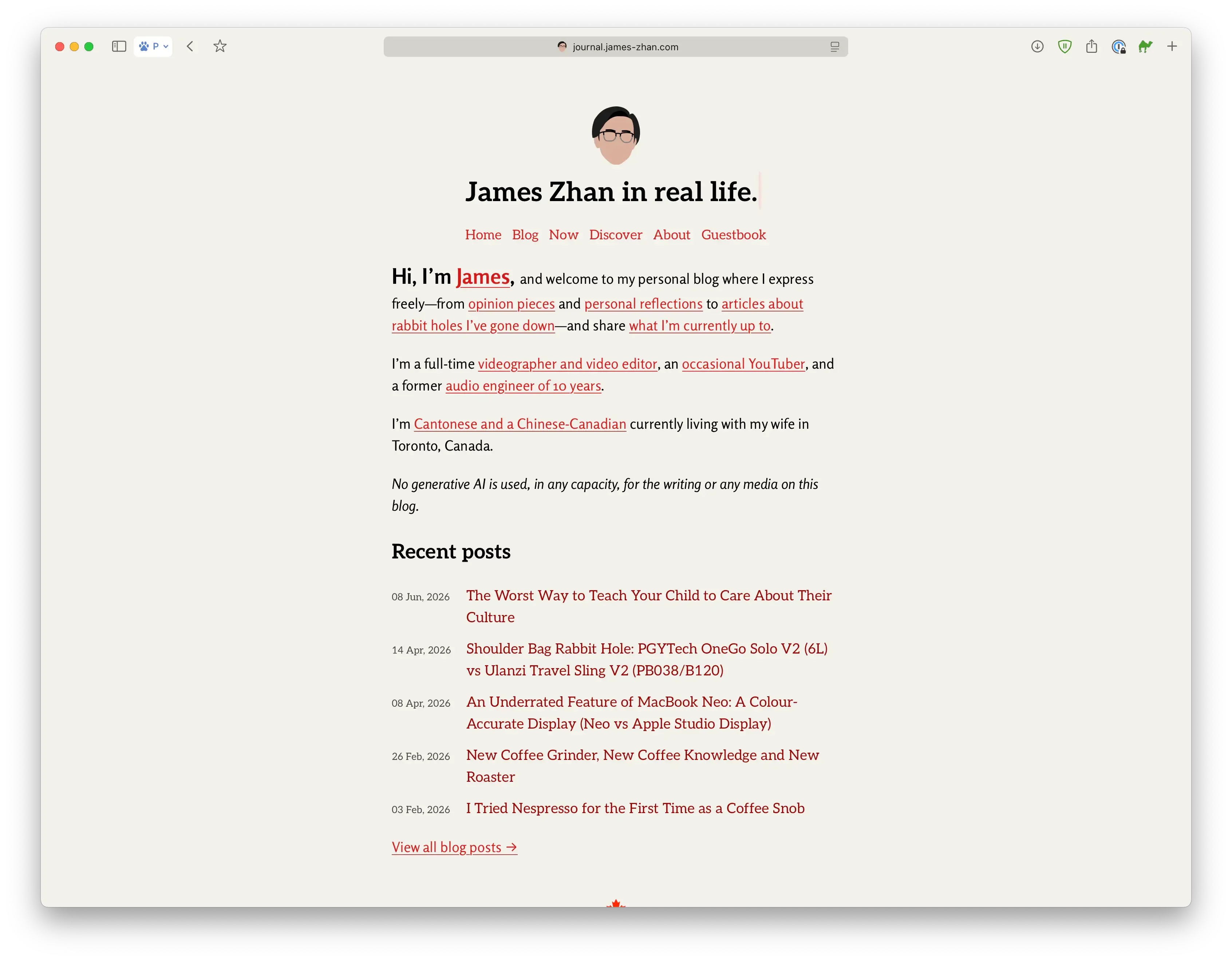
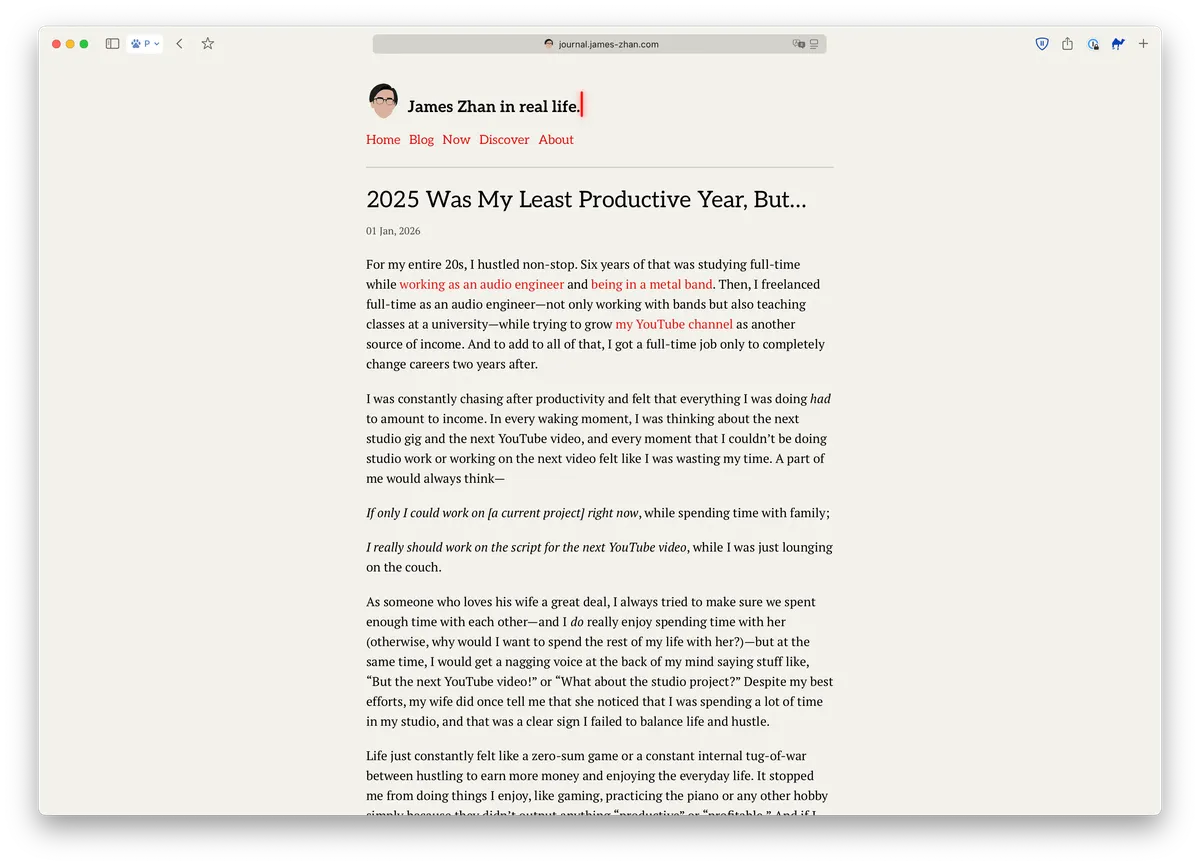
For the rest of the blog, I envisioned it to be more minimalist and to have better visual hierarchy. The persistent sidebar in V3 made sense for the homepage for easy navigation but, I felt that, for all other pages—especially blog posts—it was unnecessary for it to take up so much prime space on the screen all the time when the reader’s focus should be on the actual content.
After visiting many other sites for inspiration, I found that I gravitated to a sticky top bar design, where the site title and the navigation live at the very top of the site. I like that it’s much more out of the way while still remaining easily accessible.
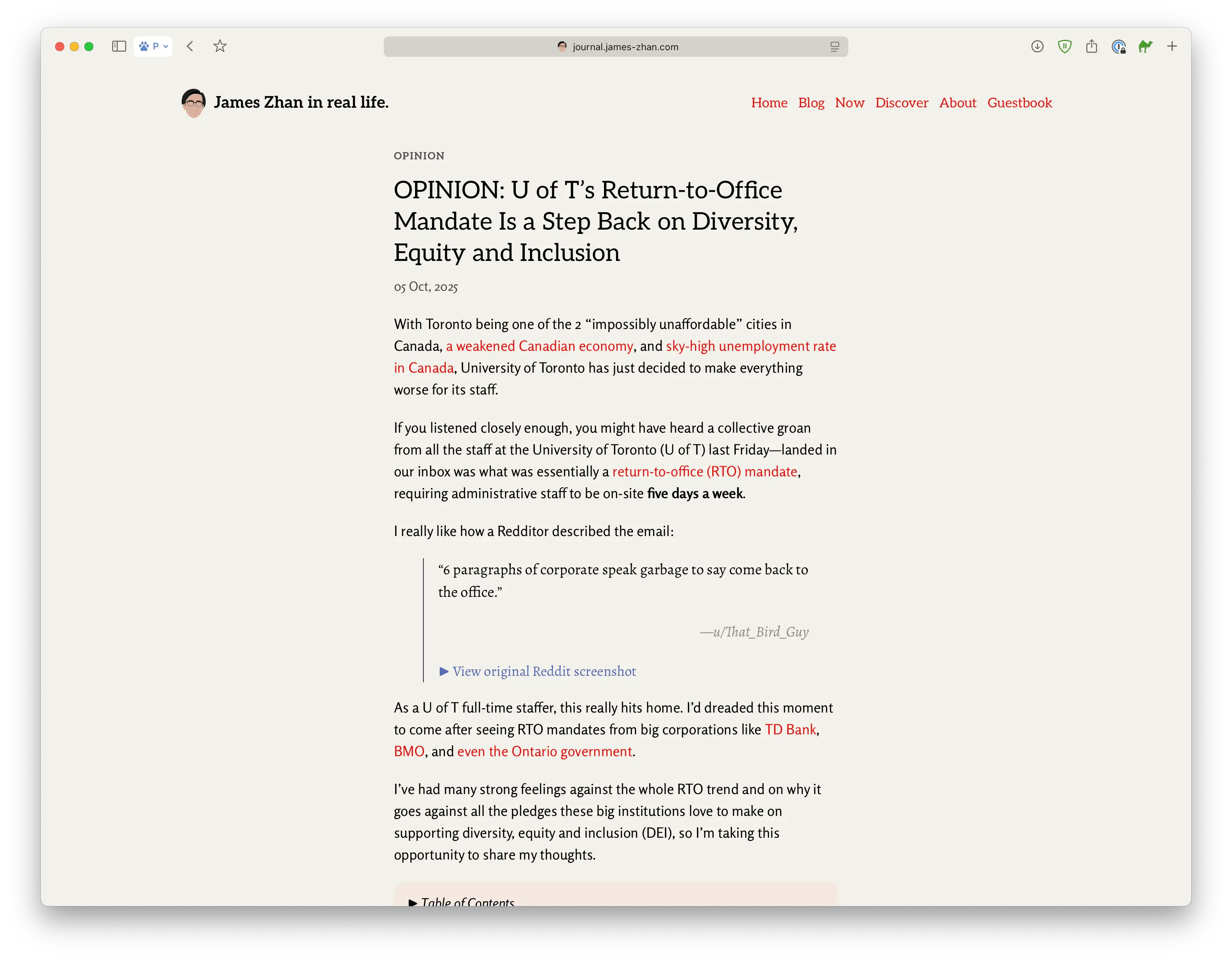
When designing the top bar, I decided to have it extend beyond the width of the main text for a couple of reasons. First, it gives the post title in the middle more room to breathe. If I had restricted the top bar to the width of the main text—which was intentionally kept rather narrow for better readability—the site title (“James Zhan in real life.”) and the six navigation links would have to resort to a stacked layout just like V2, thereby crowding the space around the post title:
Second, the wide top bar signals that the blog was designed with wider screens in mind, therefore giving it a more modern feel (at least to me). In the V2 design, one of the things I didn’t like was that the entire site was a single column in the middle, so on a higher resolution screen, like my 5K Apple Studio Display, the site felt a bit “archaic,” like it was created in the era of 4:3 monitors in the 2000s (not that there’s anything wrong with that; it was just not what I wanted).
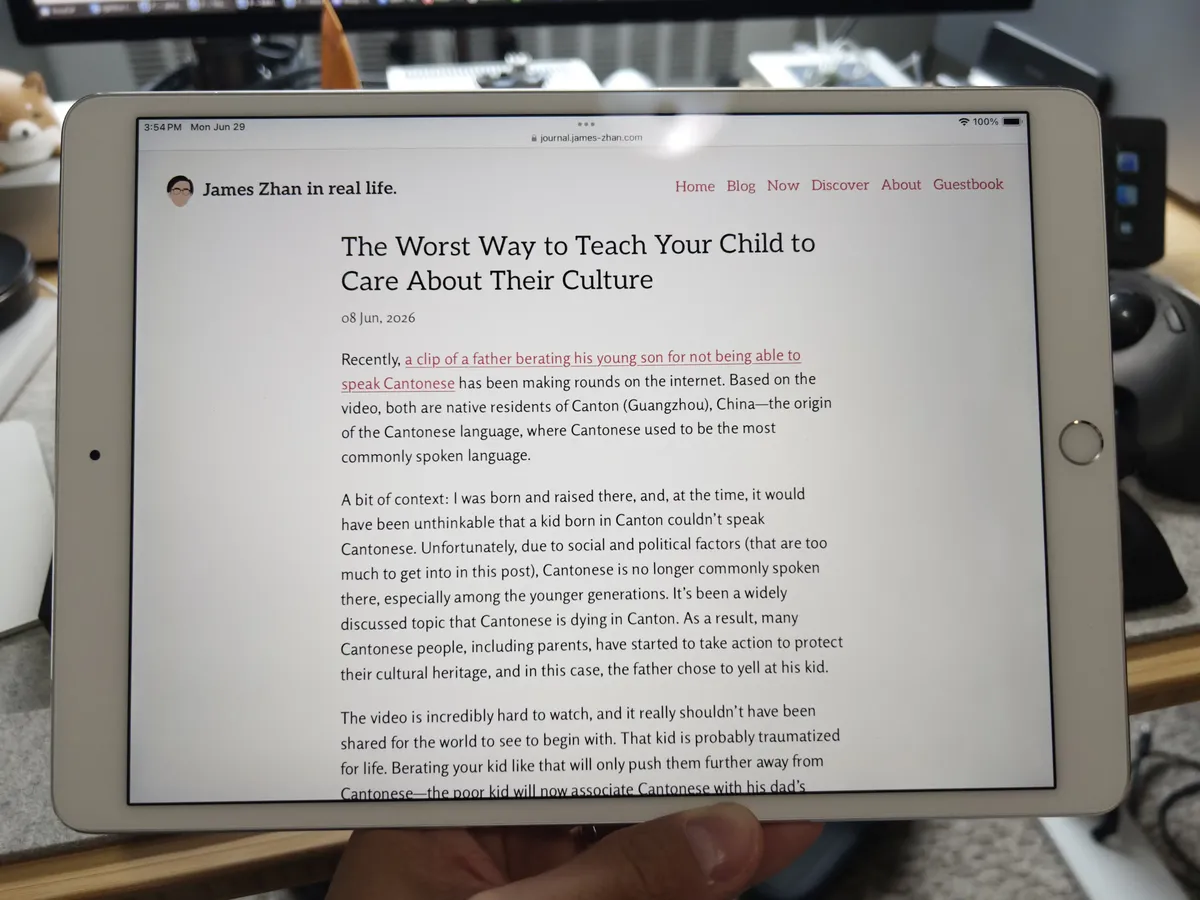
In the current V4 design, I restricted the max-width of the top bar to 1200px so that on smaller computer screens, like that of a iPad, the site title and the navigation links look flushed to the edges—
—without becoming ridiculously far away from the main blog content on wider displays.
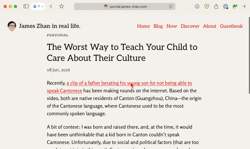
To further remove distractions while someone is reading a blog post, the site title, “James Zhan in real life.” fades away upon scrolling down, leaving only my little avatar as a subtle reminder that the reader is on my site and a way to return to the homepage:
Typography
Typeface is the clothes of your text.
…or something along the lines of that. I’m paraphrasing it because I no longer remember who said/wrote that but it’s one thing that stuck with me when I studied typography.
The typography for this blog has been a huge rabbit hole and time sink since day one. I dabbled a bit into typography during my undergrad while I was typesetting a book as part of a capstone project so the typography of this blog is something I constantly tweak.
Some thoughts on the role of typography
When it comes to the typography of text-heavy online sites—from personal blogs and online magazines (like The Artifice) to Wikipedia and technical user guides—there’re two major “schools of thoughts.” One is that typography should be “invisible” and the author should just let the words do the job; the other is that typography should grab your attention and be part of the style.
These two schools of thoughts are especially prevalent in the personal blogging sphere, I’ve noticed. Some blogs purposely set font-family to system-ui so the typeface is the same as the one used in the readers’ OS, while others chose typefaces they personally like.
For me, typography can never be “invisible” on any sites that have an identity, especially personal blogs. The ones that use system font always jump out to me more because it’s quite jarring to see system default fonts on a site that’s meant to be all about individuality. That said, the legibility and versatility of system fonts are certainly undeniable. My eyes would most likely have an easier time reading a blog post set in Apple’s SF Pro than one set in a monospace font.
For my own blog, I want its typography to have some character and individuality without sacrificing readability.
From Source Serif 4 to PT Serif
In the early days of this blog when I had only one post published, it was impossible to choose a typeface for the body text because I wasn’t sure what kind of blog it’d end up being—it’d be like trying to pick an outfit for someone you’d never met. So, temporarily, I chose Source Serif 4 for the body text because it’s a great all-around serif typeface for on-screen text.
After publishing a “serious,” op-ed quality essay on U of T’s RTO mandate and think pieces on the meaning of citizenship and digital privacy, I felt that Source Serif 4 is too “friendly-looking”—it’s warm and bookish, and has great italics. I wanted something a bit more neutral, stiffer and colder, and so I changed it to PT Serif.
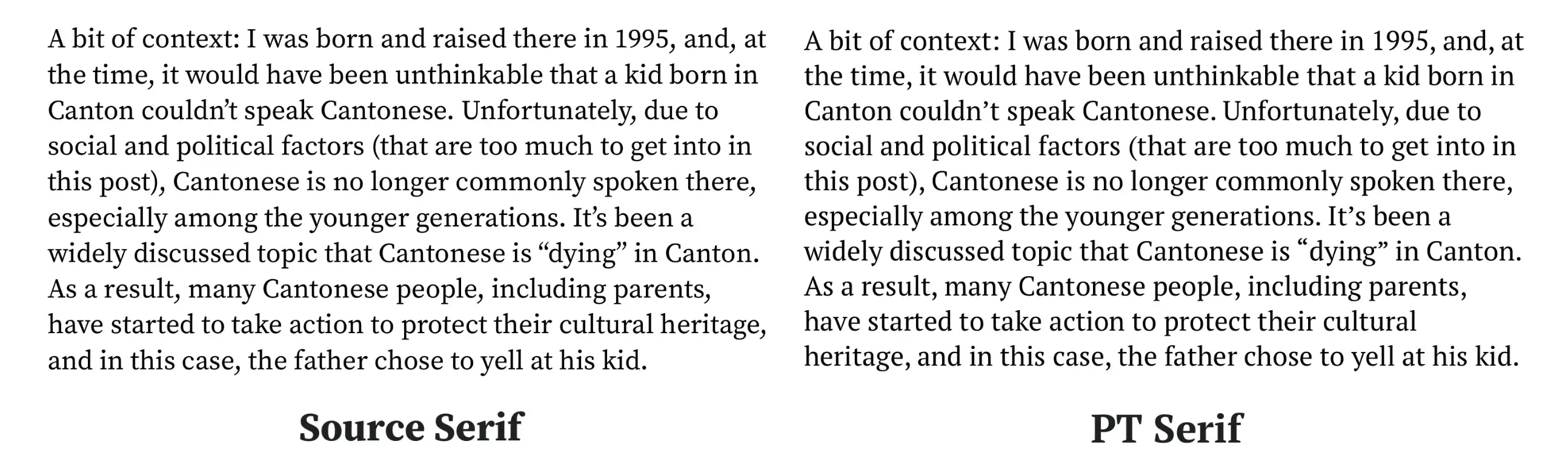
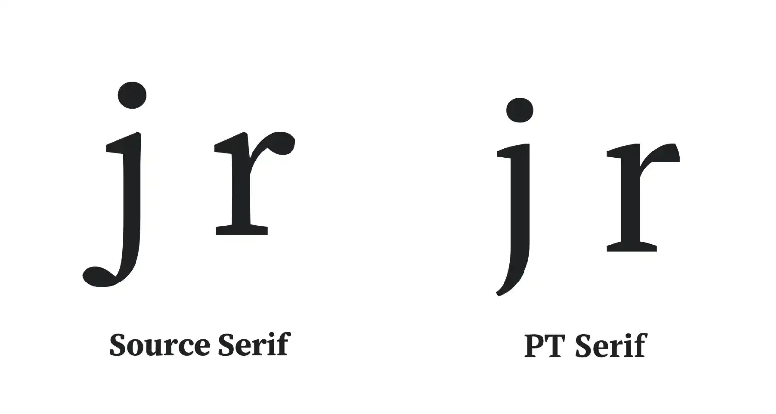
PT Serif feels much stiffer than Source Serif 4 due to having less curves and more sharp edges. Compare the descender (the “hook”) of the letter “j” and the shoulder (the little arm) of “r”:
And also the number “3”:
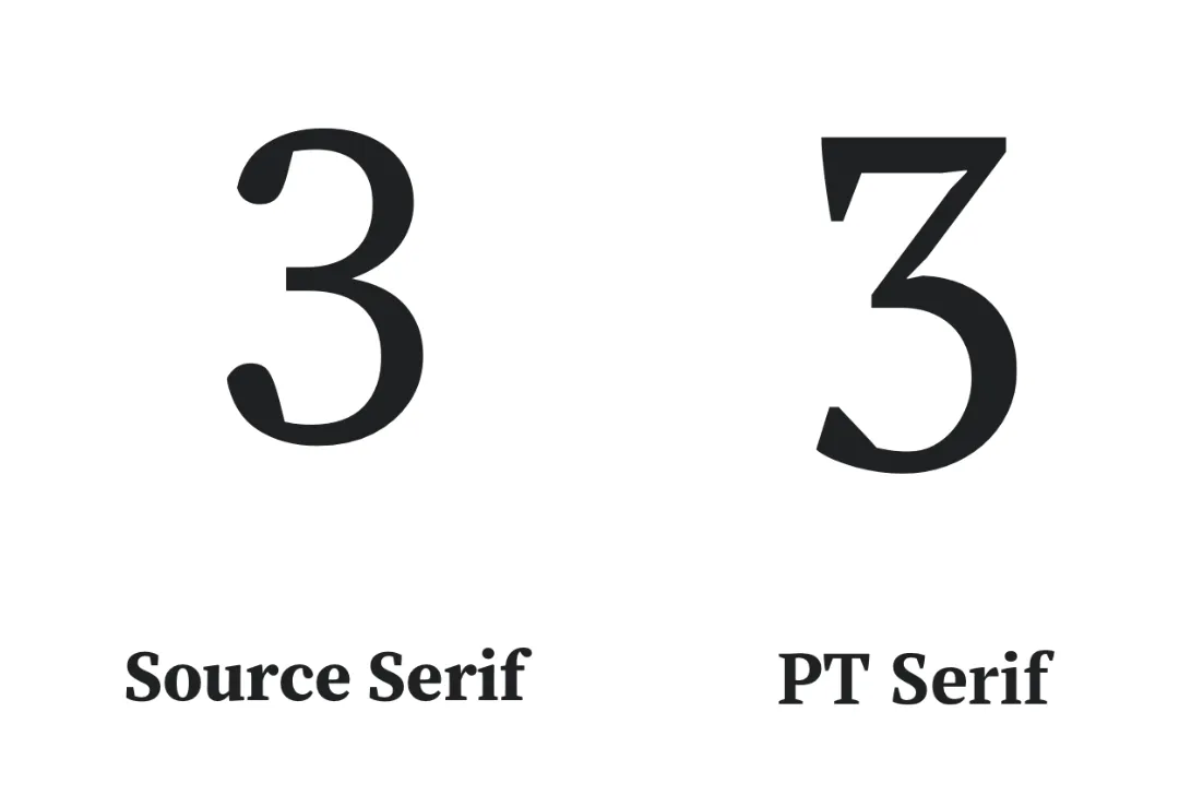
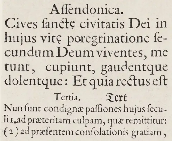
The reason why the number “3” looks like that in PT Serif is that PT Serif was originally designed for the Cyrillic script, which has the character ze, and it looks like this: З. That’s different than the Arabic number “3.” These two characters look almost identical in many typefaces that aren’t designed with Cyrillic in mind:
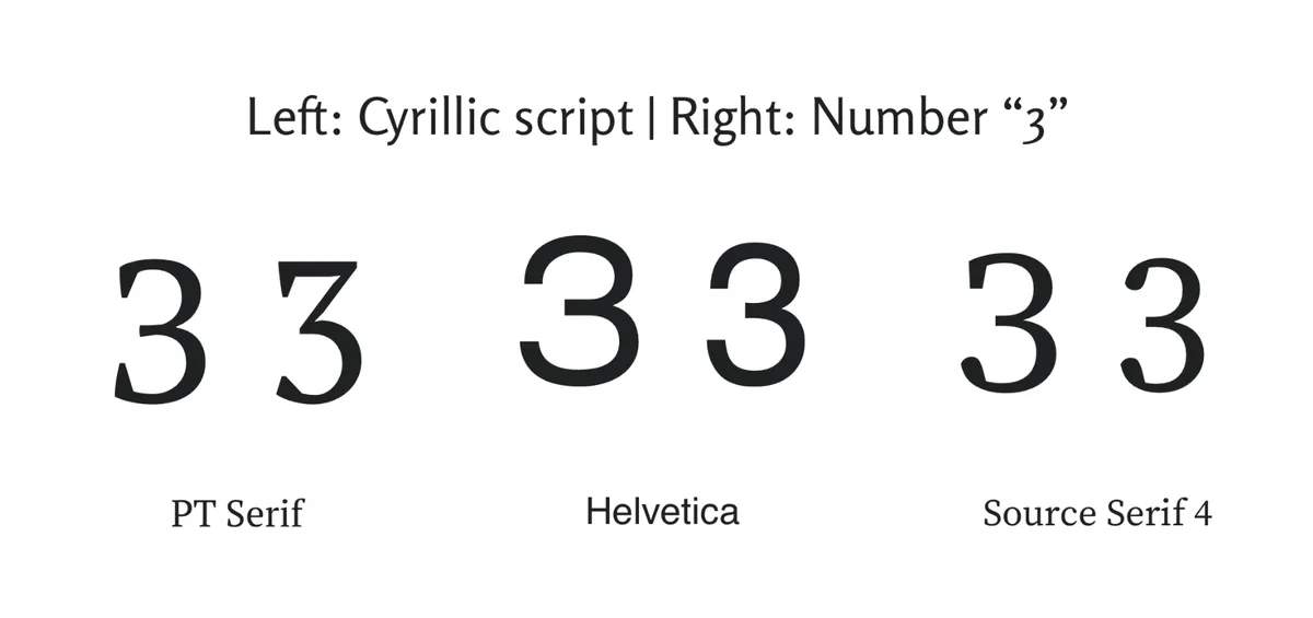
You can see that these two characters are easily distinguishable in PT Serif, but that’s really not relevant for my blog since I’m not writing in Cyrillic script. What mattered was that I really dislike the “flattened” top of the number “3” in PT Serif. It doesn’t look pleasant to me at all.
While I wasn’t fully happy with PT Serif, I still preferred it over Source Serif and so I stuck with it at the time—I’d already spent way too much time and tested way too many typefaces. I had told myself I needed to spend time on actually writing content for the blog.
Since then, I’ve written quite a few blog posts that are much lighter in tone and added many non-prose pages, such as my coffee log and the stuff I use, which are just bullet lists, and the changelog and “Today I Learned.” It’s clear that this blog is a smorgasbord of my thoughts, experiences and life updates, rather than only polished opinion/think pieces as I initially had thought.
Finding Rosario
Having finally realized that this blog is more personal than editorial, I started to test sans-serif typefaces. However, most sans-serif typefaces I’d tried, while looking apt for non-prose content, rendered the body text of actual blog posts too “clean,” digital and/or minimalist for my taste. (I tried IBM Plex Sans once—which is beautiful and highly readable—and my wife said it reminded her of reading work emails, haha.) I also just really love the shapes, expressiveness and readability that serif typefaces give long body texts.
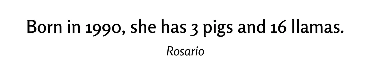
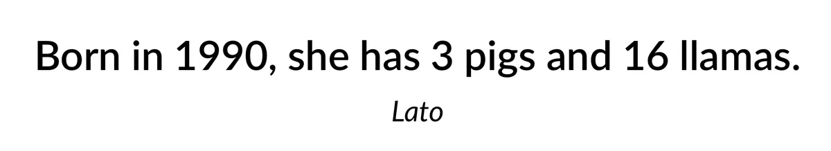
During my search for the perfect typeface, geometric and grotesque sans-serifs were quickly ruled out as I never find them very readable in long texts (which this blog has plenty of). I knew I’d have the best luck to search among the humanist ones as they have the closest “feel” to the kind of serif typefaces I like. Eventually, I discovered the gem that is Rosario, which is the font you’re reading now (unless you’re using an RSS reader).
Once I previewed a blog post set in Rosario, I knew this was the answer—it reminds me of the warmth and the rhythm (or “flow”) of serif typefaces, but subtle enough that it works well for non-prose content too. This is the results of many design details in Rosario’s letterform, but here’re my favourites:
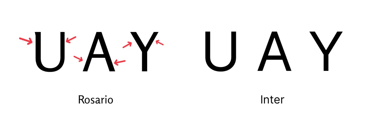
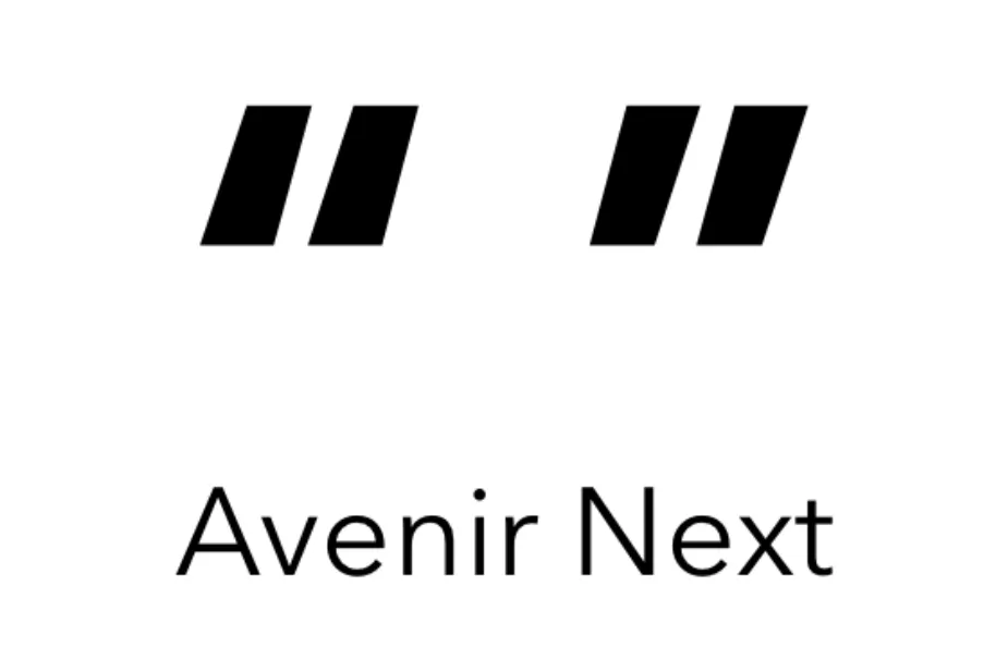
“Almost-serifs” at the terminals
I like that Rosario’s terminals are way less straight compared to many other sans-serifs. Compare the stems (vertical strokes) of the below letters in Rosario and Inter:
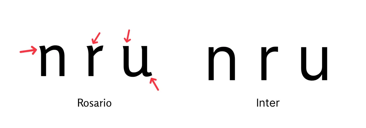
The tiny serifs take away the “digital-ness” of modern sans-serif typefaces and add a bit of flow between the letters. This is why Rosario is sometimes regarded as a semi-serif typeface.
Stroke contrast
Rosario has some stroke contrast while many other sans-serif typefaces don’t and as a result, Rosario has a bit more character than the typical sans-serif:
I find the symmetry in the typical sans-serifs to be too modern and “clean” for the vibe I’m going for with this blog.
Apophyge
Another detail I love about Rosario’s letterform is the apophyge, which is the curvature that connects the joint of the cross-stroke and the stem of a letter:
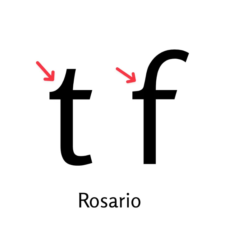
It reminds me of old printed text where each letter had small imperfections due to the nature of a physical printing press.
With a physical printing press, sometimes strokes were not well-defined and other times the ink would bled a bit. Rosario gave me a bit of that “ink on the page” feel thanks to the apophyges.
Oldstyle figures
This is one of the things that sold me on Rosario—it has oldstyle figures!
Oldstyle figures have ascenders and descenders just like lowercase letters:
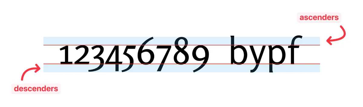
These are different than lining figures, which are much more commonly found in modern typefaces, and they all have the same height as the cap height (height of uppercase letters):
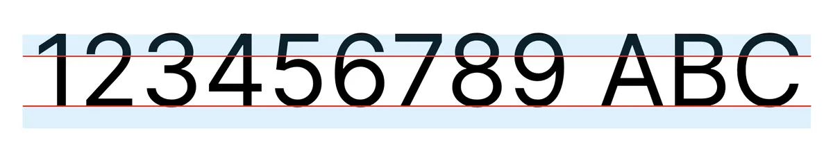
I’ve always preferred old style figures for numbers in prose because they just look more cohesive with lowercase letters:
Lining figures in body text always feel out of place because they just look like all caps to me:
Of course, there are drawbacks of oldstyle figures, and one of which is that they don’t get along with all caps. For example, I wrote about a new coffee grinder and the brand is “1ZPRESSO”:
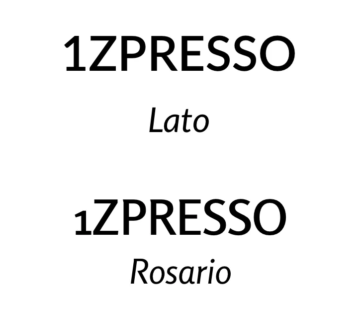
In this case, the “1” in Rosario look ridiculously dwarfed next to the all caps, and unfortunately, Rosario doesn’t have a small caps variation. Oh well, you gain some you lose some.
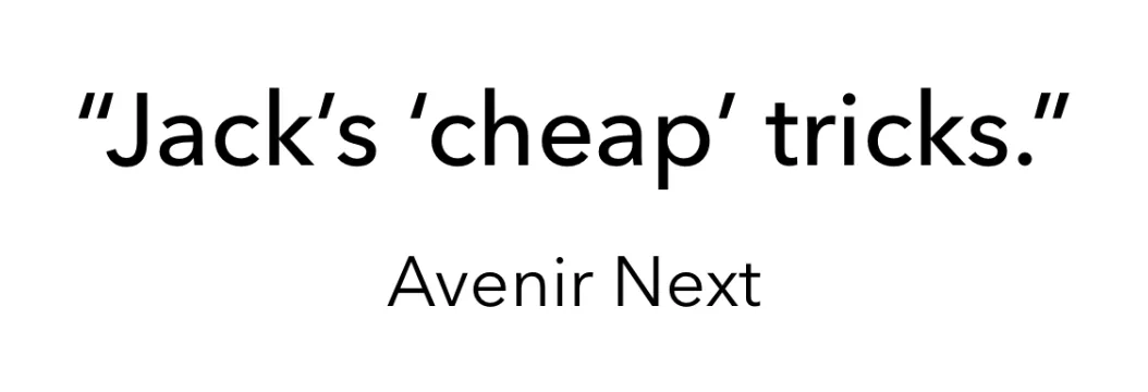
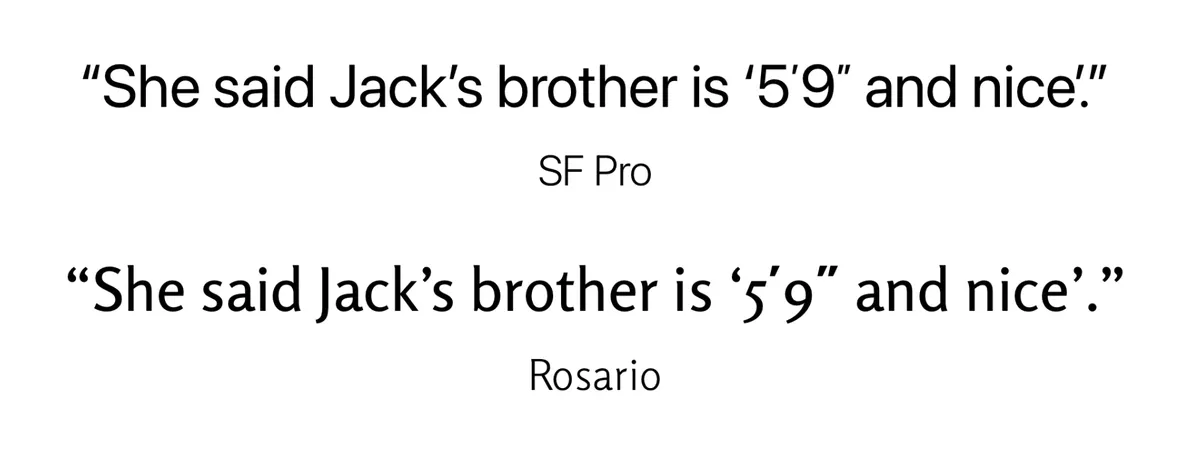
Quotation marks with serifs
Another reason I chose Rosario over other sans-serif typefaces is the quotation marks. I’m extremely particular about my quotation marks. Many sans-serif typefaces’ quotation marks have no serifs:
I personal don’t like them at all as I find them to become confusing to look at once there are several of them in the same sentence (especially on smaller or lower resolution screens):
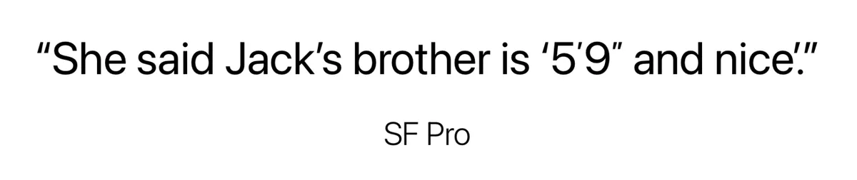
These quotation marks are even less readable once you mix them with primes—the symbols for units (yup, the symbols for inch, feet, minute, etc are not quotation marks):
Some sans-serif typefaces, like Helvetica, have quotation marks with serifs but they look very digital:
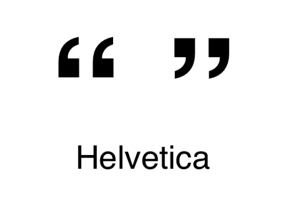
I simply don’t like them—they make me feel like I’m reading some technical document.
Meanwhile, Rosario’s quotation marks look like the ones from a typical serif typeface, and they are much, much more readable among other similar-looking hanging punctuations:
Quotation marks with serifs usually don’t fit well with sans-serif typefaces, but because Rosario has so many traces of serif typefaces, these quotation marks look like they belong.
All these these design details together gives Rosario, despite a sans-serif typeface, the warmth and rhythm of a serif typeface in body text that many sans-serifs lack (click to enlarge):
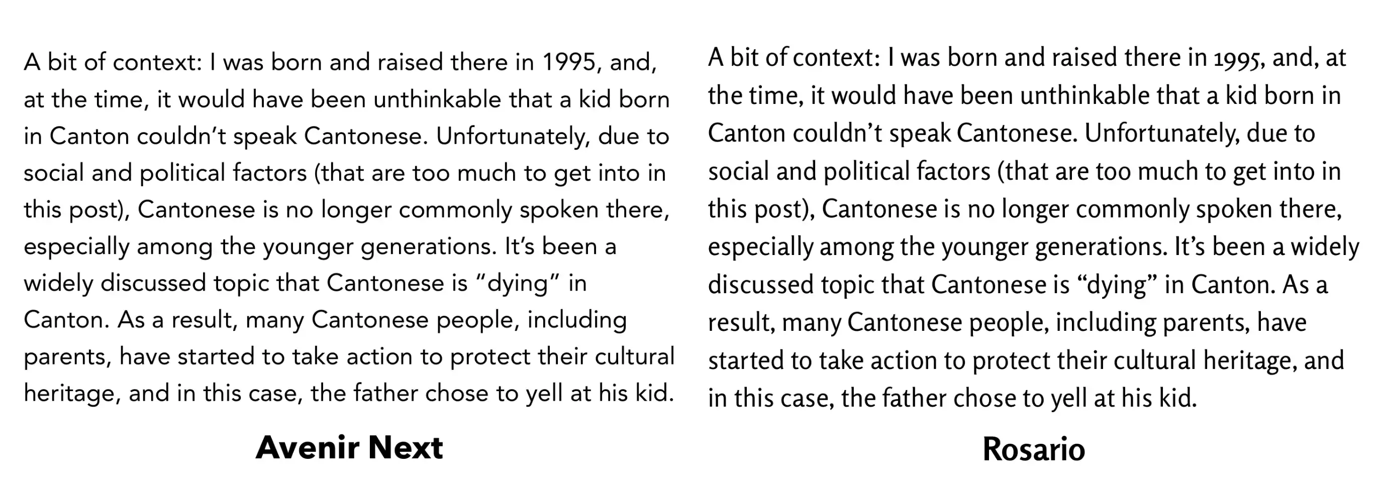
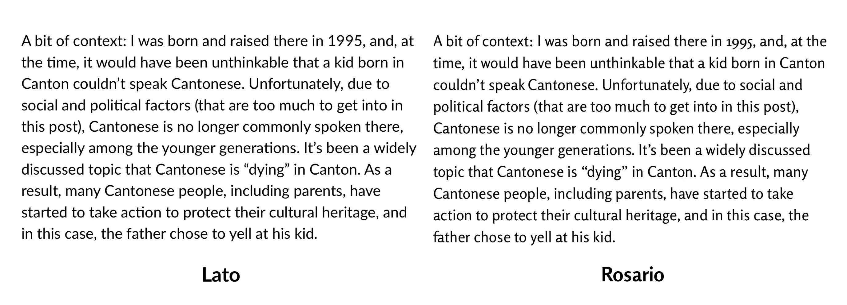
…all while looking suitable for my non-prose content.
All this is to say, I quite like Rosario and this is why I chose it as the font for body text. Is it perfect? Not at all—in addition to not having lining figures, I find Rosario to be slightly too narrow for my taste; I wish it were just slightly wider.
So yes, I’m still constantly browsing typefaces to find something that’s even better, but I’ve told myself to at least stick to Rosario for a few months so I can focus on the actual writing.
Other smaller changes
All the design changes I make to this blog are documented on the Changelog page, which is accessible in the footer.
V3 was inspired by sites with intentionally large body text, like iA’s blog, but I’ve changed my mind and so V4 is back to having a more “normal” size for body text.
I moved the blog post’s tag from the bottom of the post to above the post title, removed the hashtag and capitalized the letters, so that the tag functions as the kicker/eyebrow, signifying the category of the post. Since my blog posts vary so much in topic and tone, I think the kicker helps set the reader’s expectations before they start reading.
I added underline back to hyperlinks for better accessibility even though it’s visually a bit busier.
A few of my blog posts have a bunch of keyboard shortcuts and so I added a styling to
<kbd>:
CMD + SHIFT + A
Changed the red accent from
#DD0000to a slightly less bright one#D21A1A, and the red for visited links from#B5002Cto#970000Tweaked the highlight colour from
#ff0000to#ff1111and added a slight box shadow for a glow effectThe blog list is now grouped by months using Froodooo’s script
. . .
When I first started drafting this post, I’d never intended it to become this long! But I guess it’s another perfect addition to my Rabbit Holes series of posts. I initially started this blog mostly just to write, but I didn’t expect to enjoy the tinkering part this much as well. I hope someone out there gets something out of this :)
Previous |
Reply via email. Subscribe to my blog via email or RSS feed.